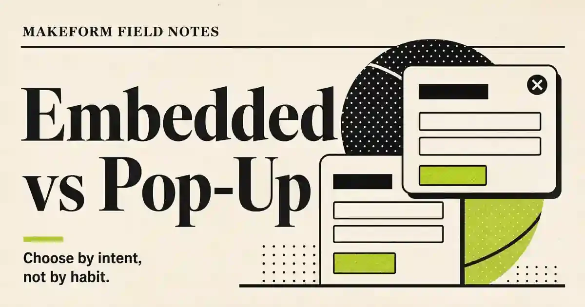
Embedded Forms vs Pop-Up Forms: Which Should You Use?
Embedded Forms vs Pop-Up Forms: Which Should You Use?
Compare embedded forms vs pop-up forms and learn when to use each for lead capture, feedback, signups, mobile UX, and higher-quality conversions.
Embedded forms and pop-up forms both work, but they solve different problems.
An embedded form sits inside the page. It is steady, visible, and tied to the content around it. A pop-up form interrupts the page. It can grab attention, but it also asks the visitor to stop what they were doing.
So the real question is not "Do embedded forms convert better than pop-ups?" That question is too broad to help anyone.
The better question is: what is the visitor trying to do right now, and does this form help or interrupt that moment?
If the visitor has strong intent, use an embedded form or a dedicated one-page form. If the visitor is drifting, leaving, or missing an offer they may actually want, a pop-up can help. If the ask needs more context, give the form more room. If the user is on mobile, be extra careful. A form that feels fine on desktop can feel rude on a phone.
This guide walks through when to use embedded forms, when to use pop-up forms, how to choose by page type, and how to measure the result without fooling yourself.
Quick answer
Use an embedded form when the form is part of the page's main job: booking a demo, joining a waitlist, requesting a quote, applying for something, giving feedback, or signing up after reading a relevant section.
Use a pop-up form when timing is the main advantage: exit intent, a limited offer, a newsletter prompt after scroll depth, a reminder before someone leaves, or a lightweight lead capture ask that should not take over the whole page.
Use a dedicated one-page form when the visitor has high intent and you want fewer distractions. This is often better for ads, email campaigns, launch waitlists, partner referrals, and longer qualification forms.
Use a guided question flow when the experience needs pacing, such as discovery, quizzes, onboarding, or research prompts that would feel heavy as a long static form.
The best setup is rarely one format forever. It is a small system: embedded forms for high-intent moments, pop-ups for well-timed prompts, one-page forms for focused campaigns, and analytics that tell you where people drop off.
Paid campaigns, email CTAs, direct asks, qualification flows
Can feel too separate if the visitor needs more context first
Completion rate and field drop-off
Guided question flow
Discovery, quizzes, onboarding, customer research
Can be slower for users with strong intent
Step-by-step drop-off
Embedded forms are usually better when the user already understands the value. Pop-ups are better when the page needs a nudge, but only if the nudge is relevant.
A bad embedded form disappears into the page. A bad pop-up annoys people. Neither format saves a weak offer.
When embedded forms work best
Embedded forms work best when the form belongs exactly where it appears.
If someone is reading a pricing page and sees a "Request a quote" form near the plan details, that makes sense. If someone is reading a product update and sees a short feedback form at the end, that also makes sense. The form is not fighting the page. It is the next step.
Use embedded forms for:
Demo requests on product and feature pages
Lead capture inside landing pages
Waitlist signups near product explanation
Feedback forms after documentation, tutorials, or help content
Event registration on event pages
Quote requests on service pages
Contact forms on company or support pages
Customer research prompts inside relevant product education
The advantage is trust. The visitor can see the form in context. They can decide whether it is worth filling out without feeling trapped.
Embedded forms also work well when the form is not just a conversion box, but part of the user experience. A calculator, product finder, onboarding survey, application form, or feedback widget should usually be embedded or linked from a clear CTA. Hiding that kind of interaction inside a surprise pop-up is usually the wrong move.
When pop-up forms work best
Pop-up forms work when the timing creates value.
That is the line. If the pop-up appears just because the page loaded, it is probably lazy. If it appears because the visitor has shown a useful signal, it can be helpful.
Useful signals include:
The visitor is about to leave
The visitor has scrolled through most of the article
The visitor has viewed multiple pages
The visitor has spent enough time to understand the offer
The visitor is on a page where the offer directly matches the topic
The visitor has clicked something that implies interest
A pop-up should feel like a relevant next step, not a random ambush.
Good pop-up use cases include newsletter signup after article engagement, discount or offer capture on ecommerce pages, exit-intent lead magnets, webinar reminders, and short feedback asks after a product action.
Bad pop-up use cases include long surveys, complex qualification forms, demo requests with six required fields, and anything that blocks a visitor before they know why they should care.
The shorter the pop-up, the better. One email field can work. Two or three fields can work if the offer is strong. A full intake form in a modal is usually asking for trouble.
The Makeform take: match the form to intent
Here is the opinion: pop-up vs embedded is not a design preference. It is an intent decision.
A visitor with high intent wants the fastest path to completion. They do not need drama. They need a clear form, a clean page, and no surprise friction.
A visitor with low intent may need a prompt. But that prompt has to earn the interruption. If the pop-up asks for too much too early, the visitor closes it and keeps moving. If it asks for something small at the right moment, it can catch demand that would otherwise leave.
Think in four levels of intent:
User intent
Best format
Example
Very high
One-page form
"Book a demo" from an email campaign
High
Embedded form
Signup form on a feature or pricing page
Medium
Embedded form or guided flow
Product quiz, waitlist, onboarding survey
Low
Pop-up or lightweight embedded prompt
Newsletter, exit offer, article lead magnet
This is also why desktop and mobile should not be treated the same.
On desktop, a pop-up has room to breathe. On mobile, it can cover the whole screen, fight the keyboard, and make the page feel broken. If you use pop-ups on mobile, keep them smaller, delay them longer, and make dismissal obvious.
How to choose by page type
Different pages deserve different form behavior.
Blog posts
For blog posts, embedded forms usually work best when the offer is tied to the topic. If the article teaches survey strategy, embed a short survey template CTA or link to an AI survey generator. If the article teaches waitlist building, embed or link to a waitlist form example.
Pop-ups can work on blog posts, but only after engagement. A newsletter prompt on page load is easy to ignore and easy to resent. A prompt after someone has read half the article has a better chance because the visitor has already shown interest.
For Makeform blog posts, I would usually choose a natural internal link first, then a contextual embedded CTA, then a delayed pop-up only if the offer is genuinely useful.
Landing pages usually favor embedded forms or one-page forms.
If the page has one job, the form should be visible and easy to complete. Sending the visitor into a pop-up can add an unnecessary step. This matters even more when traffic comes from ads, email campaigns, partner links, or launch announcements. The visitor clicked with intent. Do not make them hunt.
A pop-up can still help as a secondary capture path. For example, if someone tries to leave a pricing page, a short "Want the checklist?" or "Get the launch template" offer may make sense. But the primary conversion path should be stable.
If the goal is lead capture, start with the simplest version of the ask. A focused AI lead capture form generator can help you get the first version live, then you can decide whether it belongs embedded on the page, opened as a pop-up, or sent as a direct link.
Product pages
Product pages should use embedded forms when the ask is tied to the feature.
If the page explains AI form generation, the CTA should let the visitor start building or explore Makeform features. If the page explains surveys, link to a relevant tool such as the AI survey generator. If the page explains waitlists, send users to a focused waitlist workflow.
Pop-ups on product pages should be used carefully. If the visitor is evaluating the product, interrupting them too early can make the product feel less serious.
Help docs and tutorials
Docs are not landing pages. People arrive there to solve a problem.
Use embedded feedback forms at the end of docs, not aggressive pop-ups. Ask one or two questions: Did this help? What were you trying to do? What was missing?
This is a good place for partial submission analysis. If people start giving feedback but do not finish, that may tell you the question is too broad, too vague, or placed too far from the user's actual task.
Ecommerce and offer pages
Pop-ups can work better here because offers are often time-sensitive or incentive-driven. Exit intent, cart abandonment, and first-time visitor discounts are reasonable use cases.
Still, do not treat the pop-up as the whole strategy. Embedded forms can capture email signups, waitlists, back-in-stock alerts, and product questions without blocking the page.
Desktop vs mobile: do not ship the same experience blindly
Mobile is where many pop-up strategies get ugly.
A desktop pop-up may feel like a small prompt. The same pop-up on mobile can cover the entire page, trigger the keyboard, hide the close button, or make the user lose their place.
For mobile forms:
Keep pop-ups short
Delay pop-ups until there is clear engagement
Avoid full-screen modals unless the CTA is very high value
Make close buttons obvious
Keep fields large enough to tap
Use fewer required fields
Test the keyboard behavior
Prefer embedded forms when the user is already on a high-intent section
Embedded forms also need mobile care. A form that looks compact on desktop can become a long scroll on a phone. Break up fields. Put the easiest question first. Avoid side-by-side fields that collapse awkwardly.
The point is not "mobile first" as a slogan. The point is that the user's patience, screen size, and keyboard all changed. The form has to change with them.
What to measure
Do not measure embedded and pop-up forms with one lazy metric.
A pop-up may get more immediate starts because it interrupts the user. That does not mean it gets better leads. An embedded form may get fewer starts but better intent. A one-page form may have fewer distractions and higher completion for campaign traffic.
Track these signals:
Signal
Why it matters
View-to-start rate
Shows whether the form gets attention
Start-to-completion rate
Shows whether the form feels worth finishing
Field drop-off
Shows which question creates friction
Close rate for pop-ups
Shows whether the interruption is too aggressive
Partial submissions
Shows where interest turns into friction
Lead quality
Shows whether the format attracts useful responses
Device split
Shows whether mobile users are struggling
Source split
Shows whether traffic from ads, email, organic, or product behaves differently
Partial submissions are especially useful. A partial submission is not just a failed conversion. It is a record of where someone was willing to start but not willing to finish.
If pop-up partials show many people entering an email but skipping company size, the second field may be too much. If embedded form partials show people dropping at an open-ended question, the prompt may be too vague. If mobile users abandon after the first screen, the layout may be the problem.
With Makeform, you can review completed and partial submissions to look for patterns instead of staring at a spreadsheet. That gives you a better question than "which format won?" It lets you ask, "where did each format create trust or friction?"
How Makeform helps you test form formats
Makeform is useful here because the decision does not need to be theoretical.
You can use AI to generate a first draft of the form, then adapt it for the format you want to test:
Short pop-up version: one or two fields, clear offer, low friction
Embedded version: more context, a few more fields, placed near relevant copy
One-page version: focused flow for paid, email, or partner traffic
Research version: cleaner question order for feedback, onboarding, or customer discovery
Then you can compare the actual behavior:
Which version gets started?
Which version gets finished?
Which version gets better answers?
Which version creates more partial submissions?
Which version works better on mobile?
Which version sends the right data to sales, support, or product?
This is the practical path. Generate fast, publish cleanly, measure friction, and improve the form based on real submissions.
Common mistakes
Showing the pop-up too early
If the pop-up appears before the visitor understands the page, it is just noise. Delay it until the visitor has shown interest.
Asking too many questions in a pop-up
Pop-ups should be short. If you need more fields, send users to a one-page form or use an embedded form with context.
Hiding the main CTA
A pop-up should not replace the main conversion path. Your page still needs a visible embedded CTA or form.
Treating mobile as an afterthought
Mobile users are less patient with blocked screens, tiny fields, and awkward keyboards. Test mobile separately.
Optimizing for starts instead of outcomes
A pop-up that gets lots of email addresses but low-quality leads may not be better. Measure completion, lead quality, and follow-up outcomes.
Ignoring partial submissions
Partial data is where the friction shows up. Read it. Segment it. Fix the form.
So, which should you use?
Use embedded forms as your default for high-intent pages and context-rich asks.
Use pop-up forms as a targeted prompt, not as your main strategy.
Use one-page forms when the visitor came from a focused CTA and should not be distracted.
Use guided question flows when the questions need pacing or clearer ordering.
The best form format is the one that fits the user's moment. Pop-ups capture attention. Embedded forms capture intent. One-page forms reduce distraction. Guided flows help people answer without feeling dumped into a wall of fields.
Pick the format based on the job, then measure what happens.
FAQ
Are embedded forms better than pop-up forms?
Embedded forms are better when the visitor already has intent and the form fits the page. Pop-up forms are better when timing is the main advantage, such as exit intent or a relevant offer after engagement.
Do pop-up forms hurt user experience?
They can. A pop-up that appears too early, asks too much, or behaves badly on mobile will hurt the experience. A short, well-timed pop-up tied to the page context can still be useful.
Are pop-up forms good for mobile?
Use them carefully. Mobile pop-ups should be short, easy to close, delayed until engagement, and tested with the keyboard open. For high-intent mobile users, embedded or one-page forms are often cleaner.
What is the best form format for lead capture?
For high-intent lead capture, use an embedded form or a one-page form. For low-intent or exit-intent capture, use a short pop-up. For guided qualification, use a question flow that starts easy and asks for more detail only when needed.
Should I use both embedded and pop-up forms?
Yes, if they serve different moments. For example, use an embedded demo form on a product page and an exit-intent pop-up for a lighter resource. Do not show two forms that compete for the same action.
How can I test embedded forms vs pop-up forms?
Create two versions with the same offer, keep the field count fair, and compare view-to-start rate, completion rate, close rate, partial submissions, lead quality, and mobile behavior. Makeform can help you generate versions quickly and analyze the response patterns afterward.