How to Increase Survey Response Rates in 2026
Learn how to increase survey response rates in 2026 with better survey design, timing, AI-generated questions, incentives, reminders, and follow-up workflows.
Publisher
Mika Rin
2026/05/15
Learn how to increase survey response rates in 2026 with better survey design, timing, AI-generated questions, incentives, reminders, and follow-up workflows.
2026/05/15
If you want to increase survey response rates, the main job is not to beg harder. It is to make the survey worth answering and simple to finish.
That means fewer questions, clearer invitations, better timing, stronger mobile usability, and a survey format that matches the respondent's intent. AI can help with the first draft, but the real lift comes from designing the survey around one decision you need to make.
This is for product teams, marketers, founders, customer success teams, educators, and operators who need more completed survey responses without turning the survey into a chore.
| Problem | Better move |
|---|---|
| People do not see why you are asking | Explain the purpose in one sentence before the survey starts |
| The survey feels long | Cut every question that does not change a decision |
| The first question is hard | Start with an easy, low-friction question |
| The form feels like paperwork | Use a clean, mobile-friendly form or conversational survey flow |
| The format does not match intent | Use one-page forms for high-intent tasks and conversational flows for softer discovery |
| Drop-off hides useful signal | Review partial submissions to find where people quit and which groups struggle |
| The invitation is vague | Tell people who should answer, how long it takes, and what happens next |
| Mobile users struggle | Use short labels, large tap targets, and fewer dense grids |
| Desktop users need to compare details | Keep sections scannable and avoid hiding everything behind one-question screens |
| Reminders feel spammy | Send 1-2 useful reminders with a clear deadline |
| Respondents never hear back | Share what changed because of the survey |
The simple version: better survey response rates come from trust, timing, and friction removal. The survey itself matters as much as the email, product prompt, or message that promotes it.
Survey response rate is the percentage of invited people who complete your survey.
The basic formula is:
completed responses / people invited x 100 = survey response rate
If you invited 1,000 customers and 120 completed the survey, your response rate is 12%.
Small gains matter because the math stacks up quickly. For example, if a customer survey goes from an 8% response rate to a 12% response rate on 1,000 invitations, that is 40 more completed responses. That is not a fake benchmark or a Makeform performance claim. It is just the math of fewer people dropping off.
That number helps, but it can mislead you if you treat every survey the same. A short post-purchase feedback form, an employee engagement survey, a customer research questionnaire, and a public market survey all have different audiences and levels of commitment.
Instead of chasing a universal benchmark, track your own baseline by survey type. Compare customer surveys to customer surveys, event feedback to event feedback, and product research to product research. That gives you a better signal than measuring every form against a generic industry number.
The fastest way to fix a survey is to stop asking questions you are not ready to use.
Before you write the form, finish this sentence:
We need this survey so we can decide ______.
Good examples:
Weak examples:
The weak versions create bloated surveys because every possible question feels relevant. The strong versions make editing easier. If a question does not help the decision, cut it.
This matters for response rates because people can tell when a survey has no spine. A focused survey feels deliberate. A scattered survey feels like unpaid administrative work.
Most surveys are too long because teams write from the company side of the table. Every department wants one more question. Sales wants segmentation. Product wants feature feedback. Marketing wants attribution. Support wants sentiment. Leadership wants a score.
The respondent does not care about your internal routing problem.
Use this rule: start with the shortest survey that can answer the decision. Then add questions only when they make the answers easier to act on.
A practical structure:
| Survey goal | Recommended structure |
|---|---|
| Quick satisfaction check | 1 rating question, 1 optional open-ended question |
| Product feedback | 3-5 targeted questions plus 1 open-ended prompt |
| Customer research | 6-10 carefully sequenced questions |
| Employee pulse | 5-8 questions, mostly consistent over time |
| Event feedback | 4-7 questions sent while the experience is fresh |
Shorter does not mean shallow. A three-question survey can be stronger than a fifteen-question survey if the questions are specific, sequenced well, and tied to a real decision.
Your first question sets the effort level for the survey.
Do not open with a long free-text prompt, demographic question, or anything that makes the respondent stop and think too hard. Start with something simple:
Bad opener:
Describe your full experience with our onboarding process.
Better opener:
How easy was it to complete onboarding?
Then follow with:
What made it easy or difficult?
This order works because the first question creates momentum. Once someone has answered one low-friction question, the next question feels less expensive.
If you use conditional logic, you can make the survey feel even shorter. Someone who had a great experience should not need to answer the same diagnostic questions as someone who struggled. Makeform's features include logic, customization, and integrations that help you route people through a cleaner survey instead of showing every question to everyone.
AI helps with survey creation because it can turn a rough goal into a first draft fast. That is a solid starting point, especially when the alternative is staring at a blank form builder.
The mistake is publishing the AI draft untouched.
A better workflow:
For example, instead of prompting:
Create a customer survey.
Prompt:
Create a 6-question survey for SaaS trial users who did not activate. The goal is to understand whether they got stuck because of setup, unclear value, missing integrations, pricing, or lack of time. Include mostly multiple-choice questions and one optional open-ended question.
That prompt gives the survey a clear job. If you want a faster start, use Makeform's AI survey maker to generate a structured survey from a plain-language description, then edit the draft until it matches your audience.
If your team is already thinking about Google Forms, it is worth reading our guide on how to use Google Forms AI to create surveys. The key point is the same: AI helps most when you give it a specific decision, audience, and desired survey length.
People abandon surveys when the form feels like it was built for the database, not for them.
Design for the person answering:
A survey is still part of the funnel. The same design rules apply: reduce uncertainty, remove needless steps, make the next action obvious, and do not make the user hunt for the submit button.
The best survey experience often changes by device. On mobile, a long matrix question can feel brutal because the respondent has to pinch, scroll sideways, or decode tiny labels. On desktop, hiding every question behind a one-question-at-a-time flow can be slower when the respondent already knows what they want to say. Simple design is not decoration. It is fewer places for the funnel to leak.
Conversational forms can work well when the person has low intent, the topic is personal, or the survey needs a softer one-question-at-a-time pace. They can make qualitative feedback feel lighter. We covered that pattern in more depth in our guide to using a conversational form builder.
But conversational does not automatically mean higher conversion. That is the lazy take.
When the person has strong intent, a simple one-page form can be better. If someone is applying, requesting a quote, submitting a support intake, giving structured post-event feedback, or completing a B2B workflow, they may want to see the whole task, move quickly, and finish without waiting for a new screen after every answer.
Use the format that matches intent:
| Respondent intent | Better format | Why |
|---|---|---|
| Low-intent feedback | Conversational or short step-by-step survey | Reduces the psychological cost of starting |
| High-intent submission | Clean one-page form | Lets people scan, complete, and submit fast |
| Mobile qualitative feedback | Conversational or short sections | Keeps each screen light and focused |
| Desktop research survey | Sections or one-page layout | Makes comparison and review easier |
| Sensitive feedback | Step-by-step flow | Gives people more breathing room |
| Operational intake | One-page or sectioned form | Speed and clarity matter more than chat-like pacing |
The goal is not to copy Typeform's format or defend traditional forms. The goal is to choose the smallest interface that helps people finish.
A good survey invitation answers four questions fast:
Weak invitation:
Please fill out this survey.
Better invitation:
We are improving onboarding for new teams. If you joined in the last 30 days, this 3-minute survey will help us decide which setup steps to simplify next.
That version works harder. It tells the right people to respond, sets expectations, and gives a reason beyond "we want data."
For customer surveys, be specific about the benefit. For employee surveys, be specific about privacy and follow-up. For event surveys, be specific about what future programming the feedback will influence.
Avoid fake urgency. "Only takes 30 seconds" is a bad promise if the form takes four minutes. Respondents notice. Trust is hard to rebuild once the first interaction feels dishonest.
Timing can change response rates without changing a single question.
Good timing examples:
| Survey type | Better timing |
|---|---|
| Post-purchase feedback | Soon after delivery or first use |
| Event feedback | Same day or next morning |
| Onboarding survey | Right after the key onboarding step |
| Churn survey | Immediately after cancellation, with a very short form |
| Product research | After the user has experienced the feature being studied |
| Employee pulse | On a predictable cadence, not during known crunch periods |
The best moment is usually when the experience is still fresh and the respondent understands why the question is being asked.
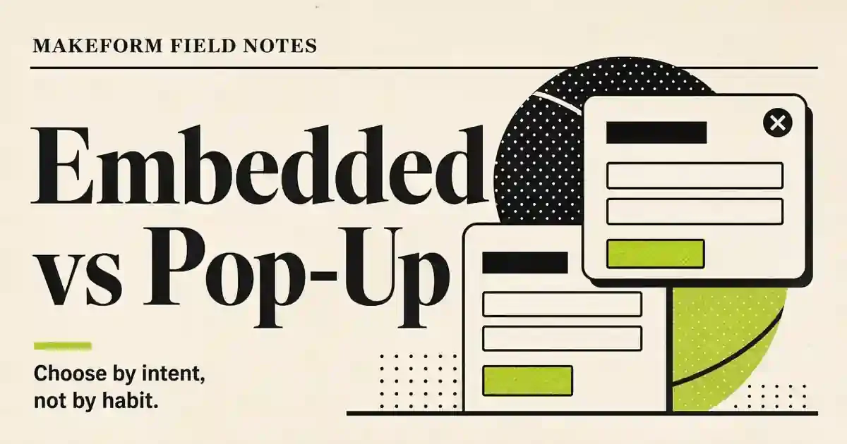
This is also why embedded forms, in-product prompts, and contextual links often outperform generic newsletter blasts. The closer the survey is to the moment of experience, the less memory work the respondent has to do.
Reminders work when they are useful. They fail when they sound like a guilt trip.
A simple reminder sequence:
Each reminder should be short and concrete. Do not resend the same wall of text. Mention the deadline and the reason the feedback matters.
If you are surveying customers, suppress reminders for people who already completed the form. That sounds obvious, but many teams still miss it, and it makes the brand feel sloppy.
For higher-value research, segment reminders by audience. A power user, new customer, and inactive user may need different context. One generic reminder rarely fits everyone.
Incentives can increase response volume, but they can also distort your sample.
Use incentives when:
Be careful when:
A good incentive respects the respondent's time without becoming the main reason for responding. For many customer and employee surveys, closing the loop can be more valuable than a gift card: show people that their answers changed something.
The invitation can be perfect and the timing can be right, but the survey still fails if the form is painful.
Before you send, test for these problems:
The best fix is usually question clarity. If respondents have to interpret your question before answering it, many will leave or give noisy answers.
Bad question:
How satisfied are you with our platform experience?
Better question:
How satisfied are you with the form setup process?
Even better:
How easy was it to create and publish your first form?
Precise questions produce cleaner answers and feel easier to complete.
A survey that is not fully completed can still tell you something useful.
Partial submissions should not be counted as completed responses, and they should not be treated as clean survey results. But they can show where the funnel breaks. If many people answer the first three questions and disappear on question four, question four deserves suspicion. If mobile users drop at a matrix question while desktop users finish, the problem may be layout, not interest.
Partial submission data can help answer questions like:
This is especially helpful for research surveys, onboarding feedback, qualification flows, and longer intake forms. Sometimes the most revealing group is not the people who finished. It is the people who started, gave you a little signal, and then decided the rest was not worth it.
Makeform supports partial submission data so teams can study incomplete responses instead of throwing them away. That gives you another layer of funnel signal: not just who completed the survey, but where different people stopped and what their early answers suggest.
Use that data carefully. Partial submissions are directional, not final truth. But for improving survey design, directional is often enough to find the next fix.
People are more likely to answer future surveys when they believe past feedback mattered.
After the survey closes, share a short follow-up:
This does not have to be a long report. A short email, changelog note, in-product message, or community post can be enough.
The point is to make feedback visible. When respondents feel like answers disappear into a spreadsheet, response rates decay over time.
Here is a common weak survey:
| Weak version | Better version |
|---|---|
| "Tell us what you think." | "Help us decide which onboarding step to simplify next." |
| 15 mixed questions | 6 questions tied to onboarding friction |
| Opens with a long free-text prompt | Opens with an ease-of-use rating |
| Same questions for everyone | Conditional follow-ups based on the rating |
| One format for every respondent | Format chosen by intent and device |
| No time estimate | "Takes about 3 minutes" |
| Generic reminder | Deadline-based reminder with the reason repeated |
| Partial responses ignored | Partial submission data reviewed for drop-off and segment patterns |
| No follow-up |
The stronger version is not just shorter. It has a clearer purpose, a cleaner respondent experience, and a stronger reason to finish.
Makeform helps with survey response work because it shortens the path from "we need feedback" to "the survey is live."
You can generate a first draft with AI, customize the questions, use logic to route respondents, publish quickly, and connect the workflow to the rest of your stack. That matters because teams often lose speed while debating the form itself.
For survey builders, the best Makeform use cases are:
A practical Makeform baseline looks like this:
| Survey situation | Makeform setup |
|---|---|
| Quick feedback after a workflow | Short one-page form with 2-4 questions |
| Onboarding friction research | AI-generated draft, edited down to 5-6 questions, with logic for follow-ups |
| Mobile customer pulse | Short sections, large tap targets, no dense matrix questions |
| High-intent intake or request | Clean one-page form with clear required fields |
| Sensitive qualitative feedback | Step-by-step flow with optional open-ended prompts |
| Funnel conversion survey | Minimal fields, fast load, clear confirmation, and integrations for follow-up |
| Longer research or intake flow | Partial submission review to understand where different user groups drop off |
Here is the small Makeform pitch: the best survey is not just a set of questions. It is a funnel. Makeform is built to handle the pieces around that funnel: AI drafting, clean layouts, mobile-friendly publishing, conditional logic, partial submissions, integrations, and fast iteration. You still need a good question. Makeform helps strip away the avoidable friction around it.
If you are comparing form builders before choosing a survey stack, our guides to Jotform alternatives and Typeform alternatives cover the broader tool landscape.
Before you send your next survey, check this list:
If you can fix only three things, fix the purpose, length, and first question. If you can fix five, add format and mobile experience. Those are usually the biggest leaks.
The best way to increase survey response rates is to make the survey shorter, clearer, and more relevant to the respondent. Start with one decision the survey will support, write a specific invitation, open with an easy question, and remove every question that does not change what you will do next.
Use the fewest questions needed to support the decision. A quick satisfaction survey may need only 2 questions. A product research survey may need 6-10. If the survey gets longer, explain why and make sure every question earns its place.
No. Conversational forms can work well for low-intent feedback, sensitive topics, and qualitative discovery. For high-intent submissions, B2B intake, structured feedback, and desktop-heavy workflows, a clean one-page or sectioned form can be faster and easier to complete.
Optimize for the device your respondents are most likely to use. Customer pulse surveys, event feedback, and post-purchase forms often need strong mobile design. Longer research surveys and internal workflows may need a desktop-friendly layout that is easy to scan and review.
Yes, partial survey responses can matter, especially for diagnosing drop-off. They should not be treated the same as completed responses, but they can reveal which questions, devices, or user groups are causing abandonment. In Makeform, partial submissions can be reviewed as a separate layer of research data.
Incentives can help, especially when the survey asks for meaningful time or targets people without an existing relationship. They can also attract rushed or low-quality responses, so keep the incentive proportional and make the survey purpose clear.
Send the survey as close as possible to the experience you are asking about. Event feedback should go out quickly after the event. Onboarding surveys should follow the onboarding step. Product feedback should come after the user has actually tried the feature.
Yes, AI can help create better survey drafts, especially when you give it a clear audience, decision, and desired length. The draft still needs human editing for bias, clarity, sequence, and actionability.
Google Forms can be enough for simple surveys, especially if your needs are basic and your team already works in Google Workspace. If you want AI-generated drafts, better logic, faster publishing, customization, and richer form workflows, a dedicated AI form builder may be a better fit.
Last updated: May 2026
| Short summary of what will change |